Framing the Questions
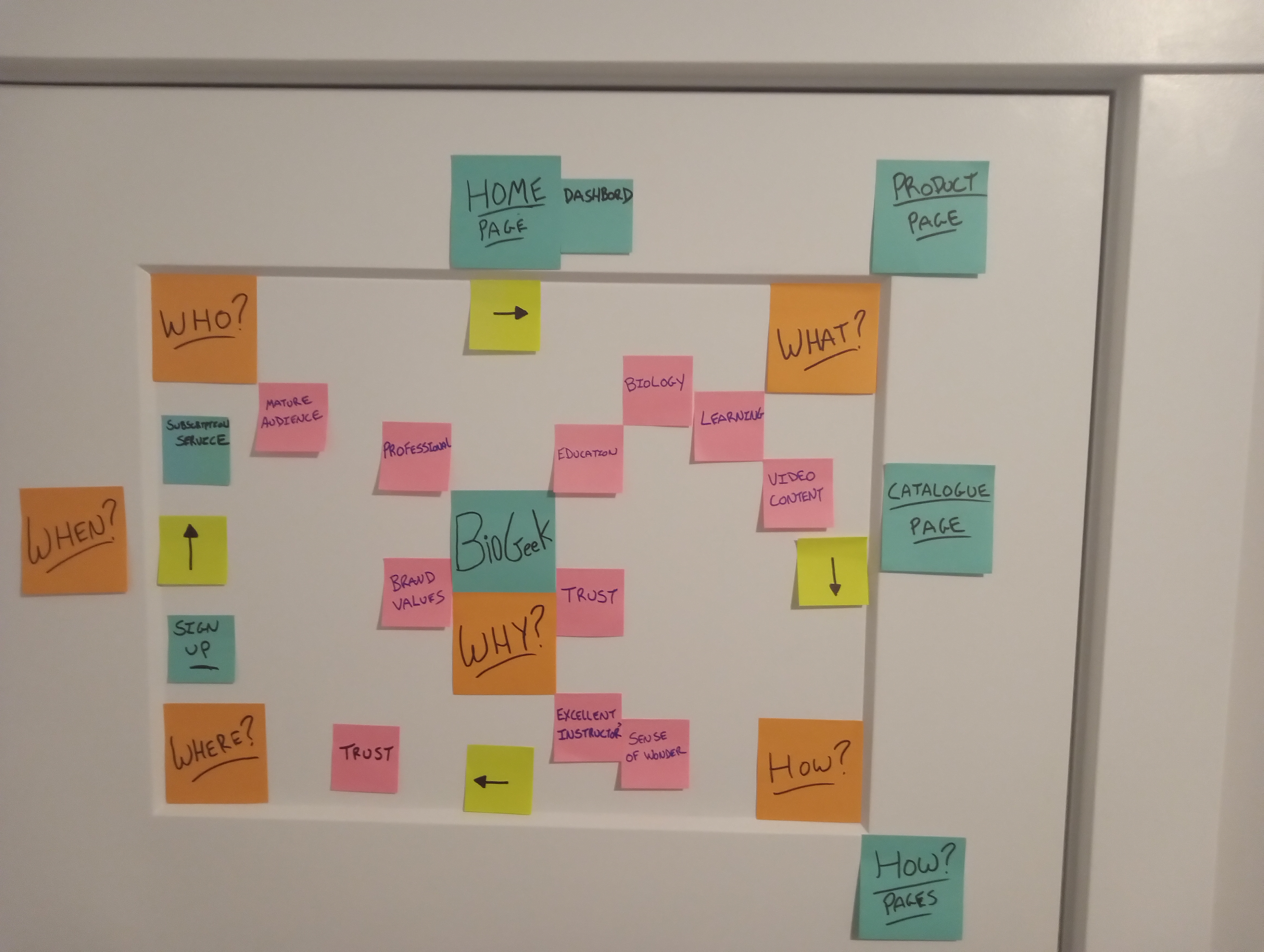
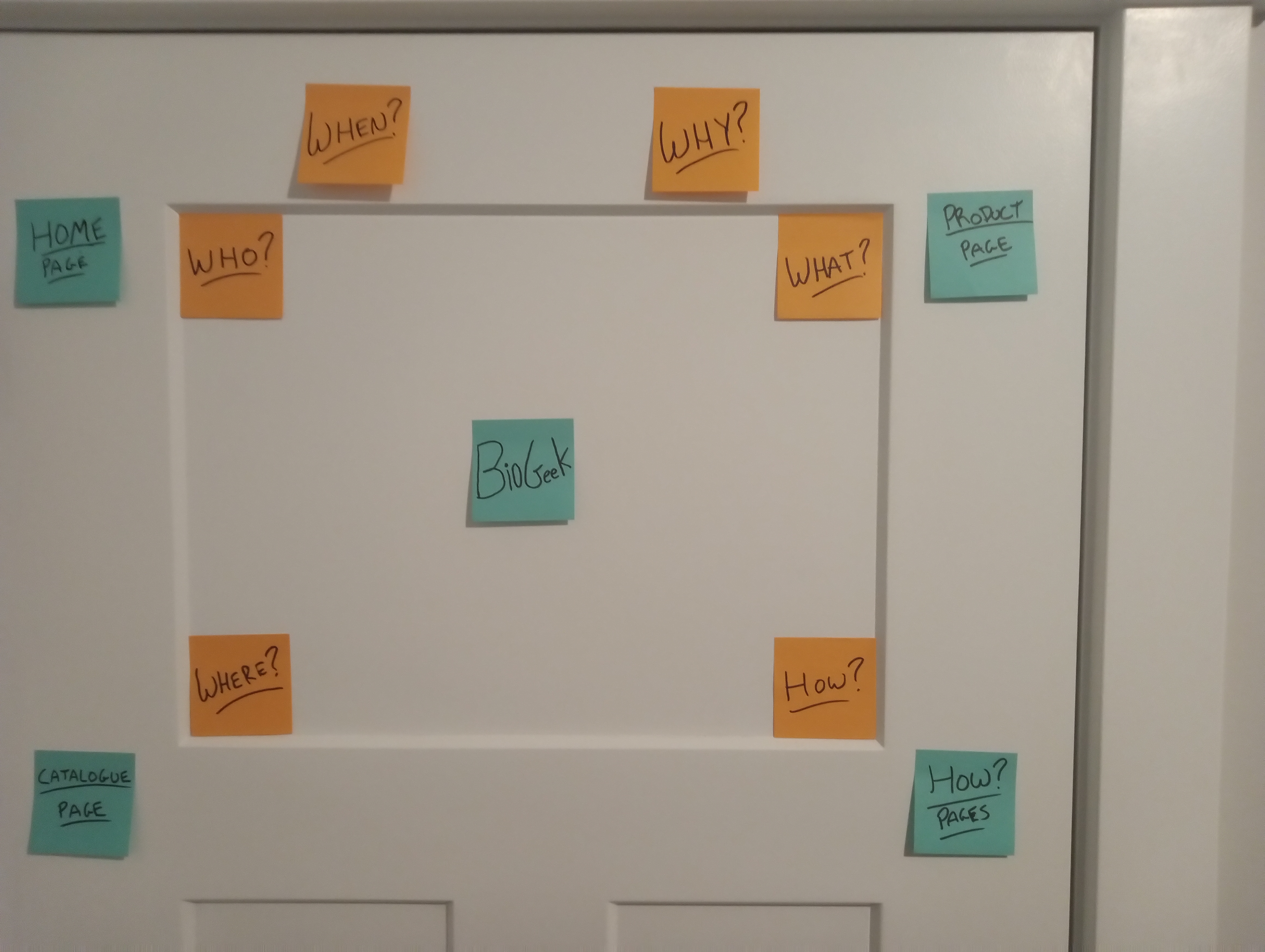
The first pass sets up the core research prompts: who the site serves, what they need to learn, why they would trust BioGeek, where subscription decisions happen, and how the page system should connect.
Interface Planning + Design
Educational biology video content for curious adult learners, balancing professional trust with the strange wonder of living systems.
The Brief
BioGeek needed a website concept that introduces the company, shows a catalogue of biology courses, demonstrates a product page, and explains how a user signs up, subscribes, and returns to a dashboard to keep watching lessons.
Research + Journey
The board work follows the thinking from broad discovery questions into an infinity-style learning loop. Each pass adds more about the ambitious adult learner: what they want, what blocks them, and what the BioGeek experience needs to solve.
The first pass sets up the core research prompts: who the site serves, what they need to learn, why they would trust BioGeek, where subscription decisions happen, and how the page system should connect.
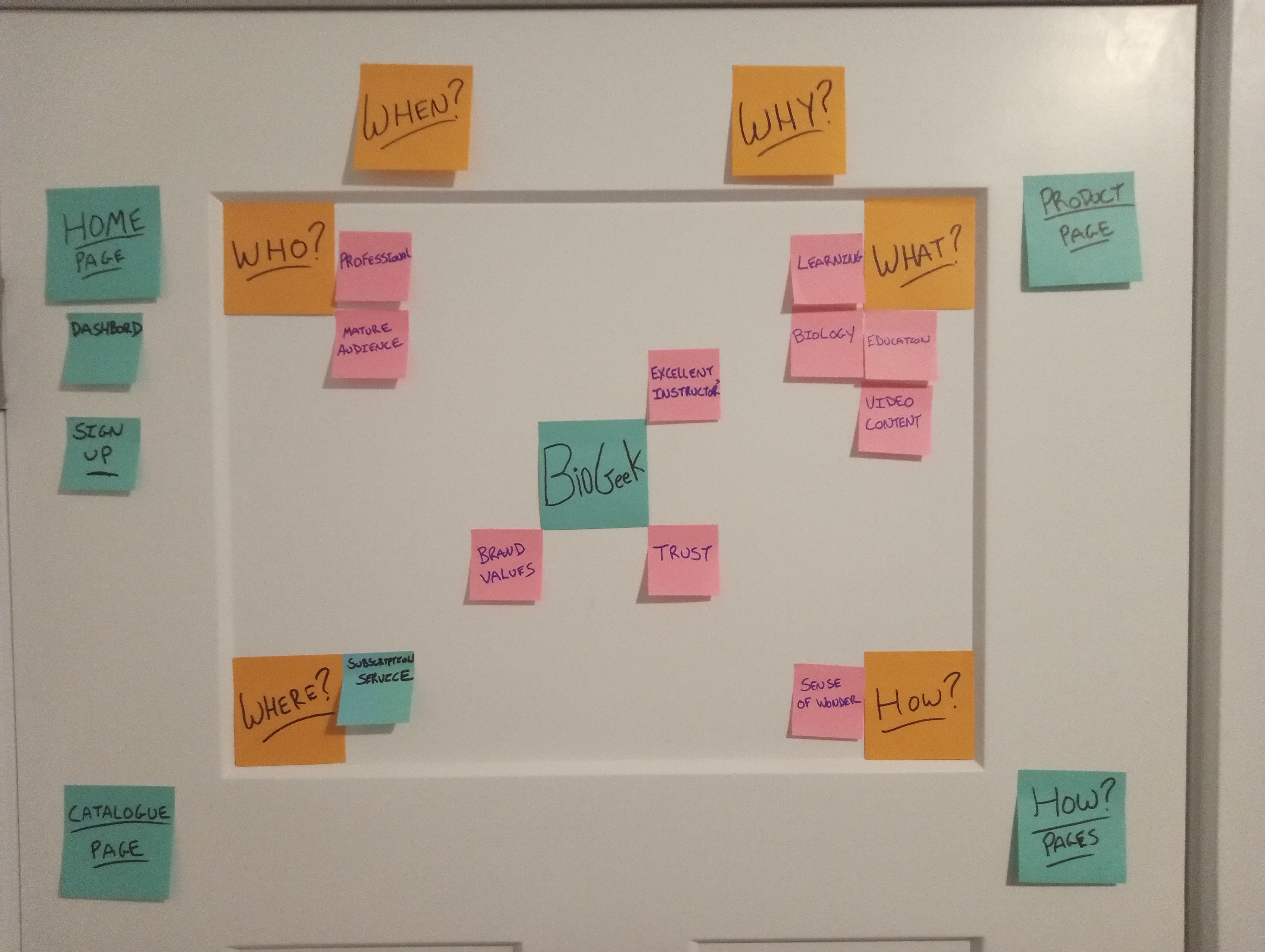
Notes begin clustering around a mature, ambitious learner who wants professional instruction, biology video content, a sense of wonder, and enough trust signals to feel comfortable paying for access.
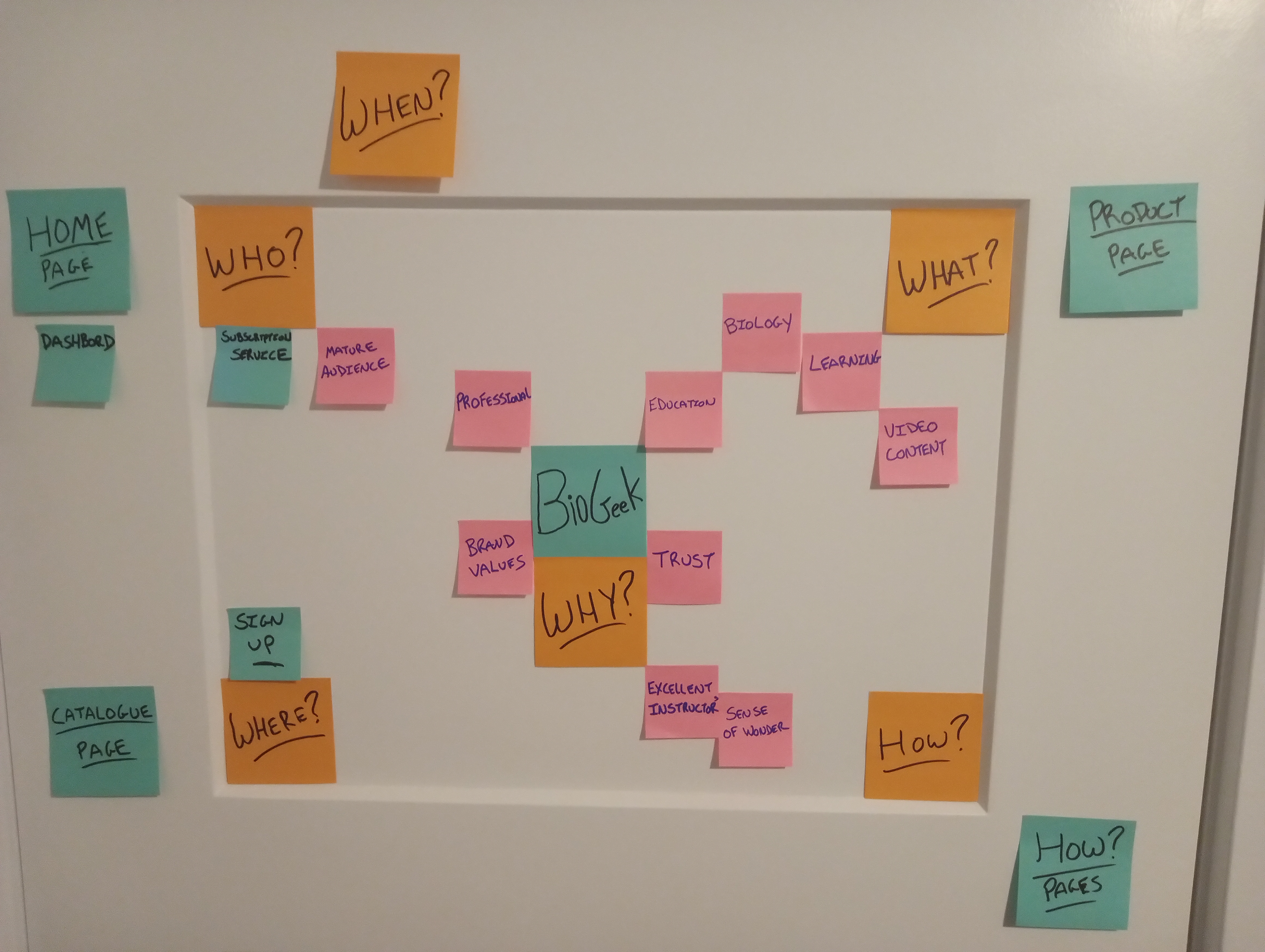
The thinking starts moving into a loop: discover the brand, understand the educational promise, compare the course content, verify instructor credibility, then return through sign-up and continued learning.
Page labels and arrows map the learner's movement between home, catalogue, product, sign-up, and dashboard. This pass highlights decision points where clarity, progress, recommendations, and account access must feel effortless.
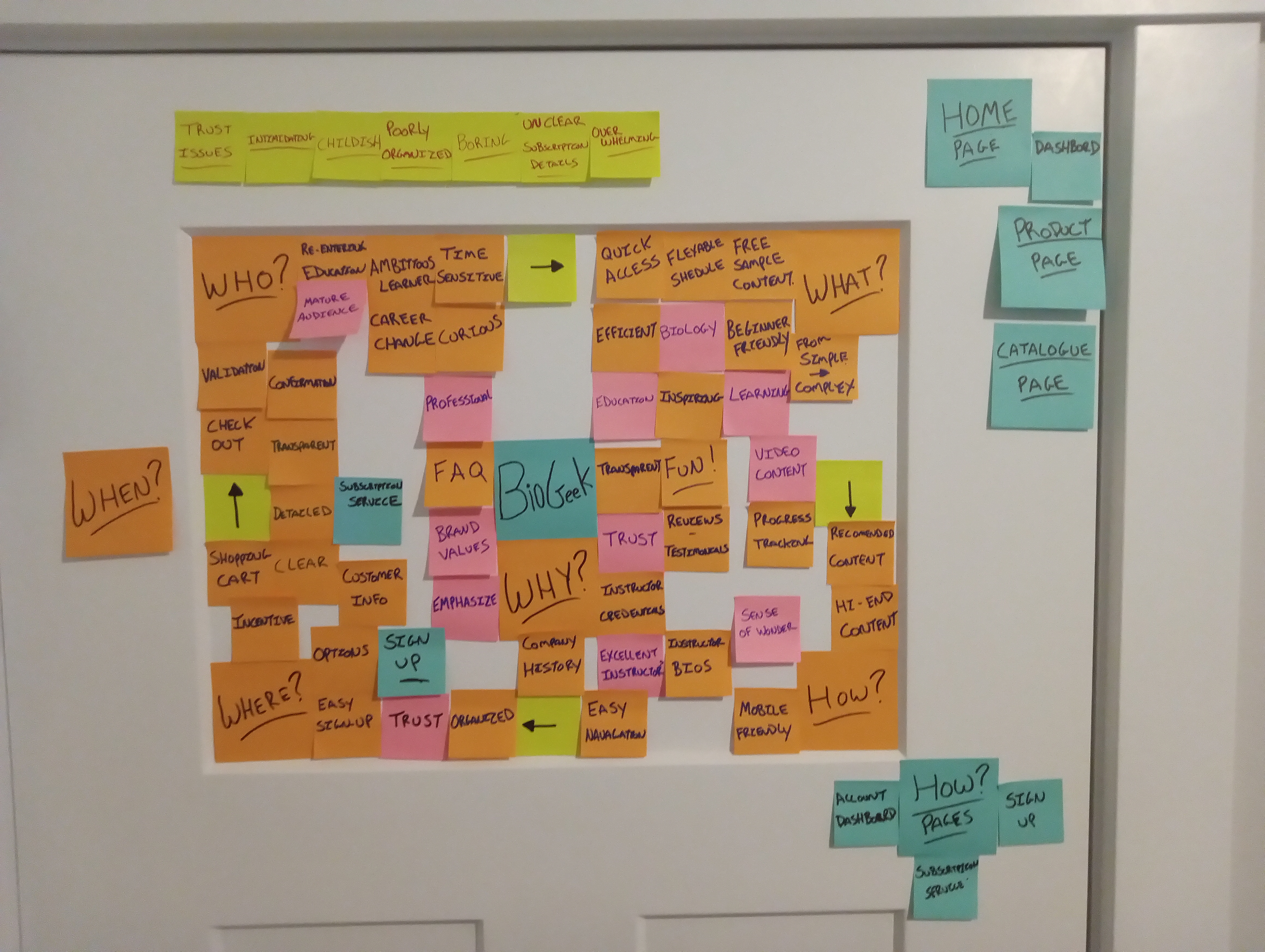
The final board adds the sharpest user needs: quick access, flexible scheduling, free sample content, beginner-friendly explanations, progress tracking, reviews, and instructor credentials. It also names the pain points BioGeek must avoid, including trust issues, intimidation, unclear subscription details, boring content, poor organization, and overload.
Empathy Maps
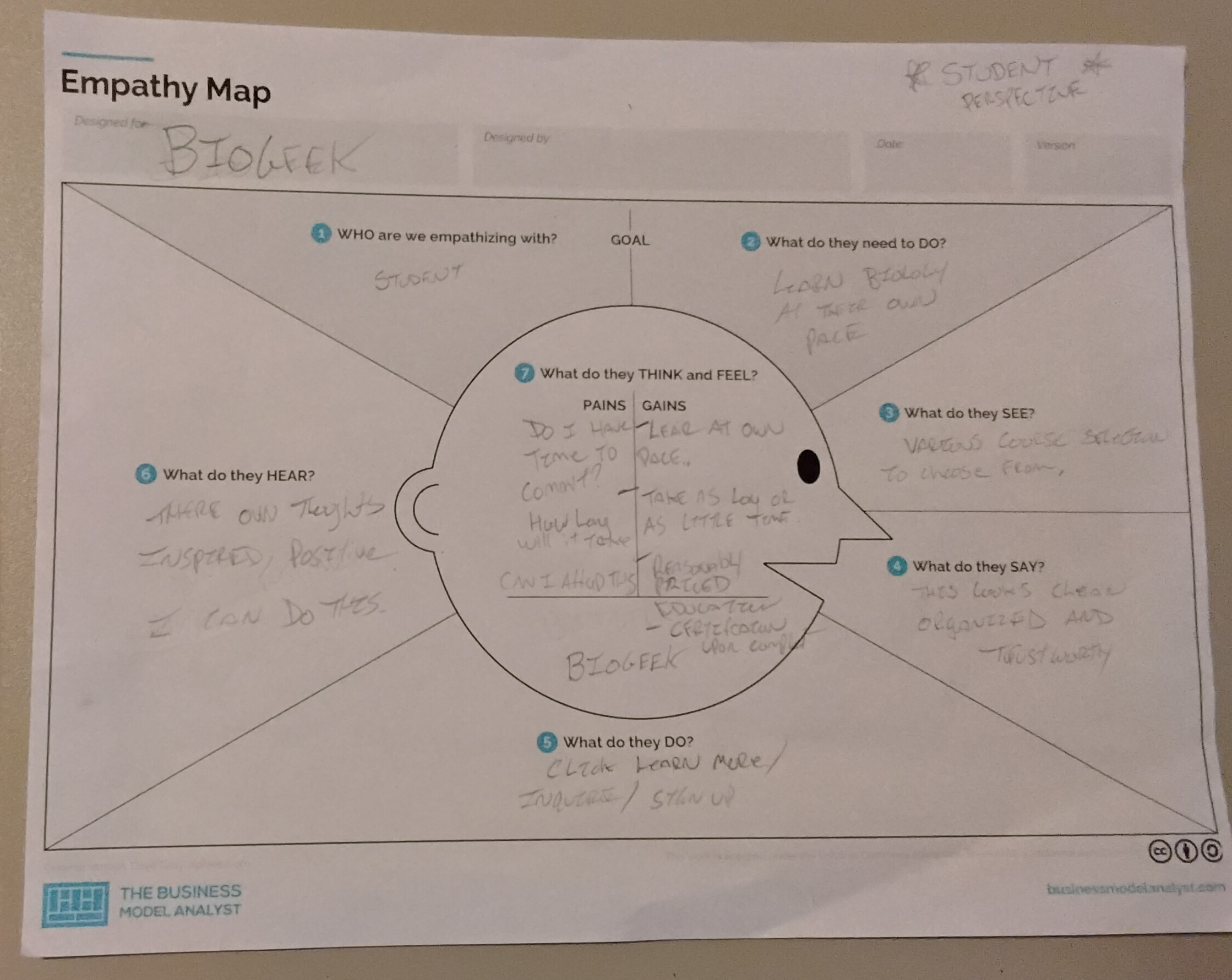
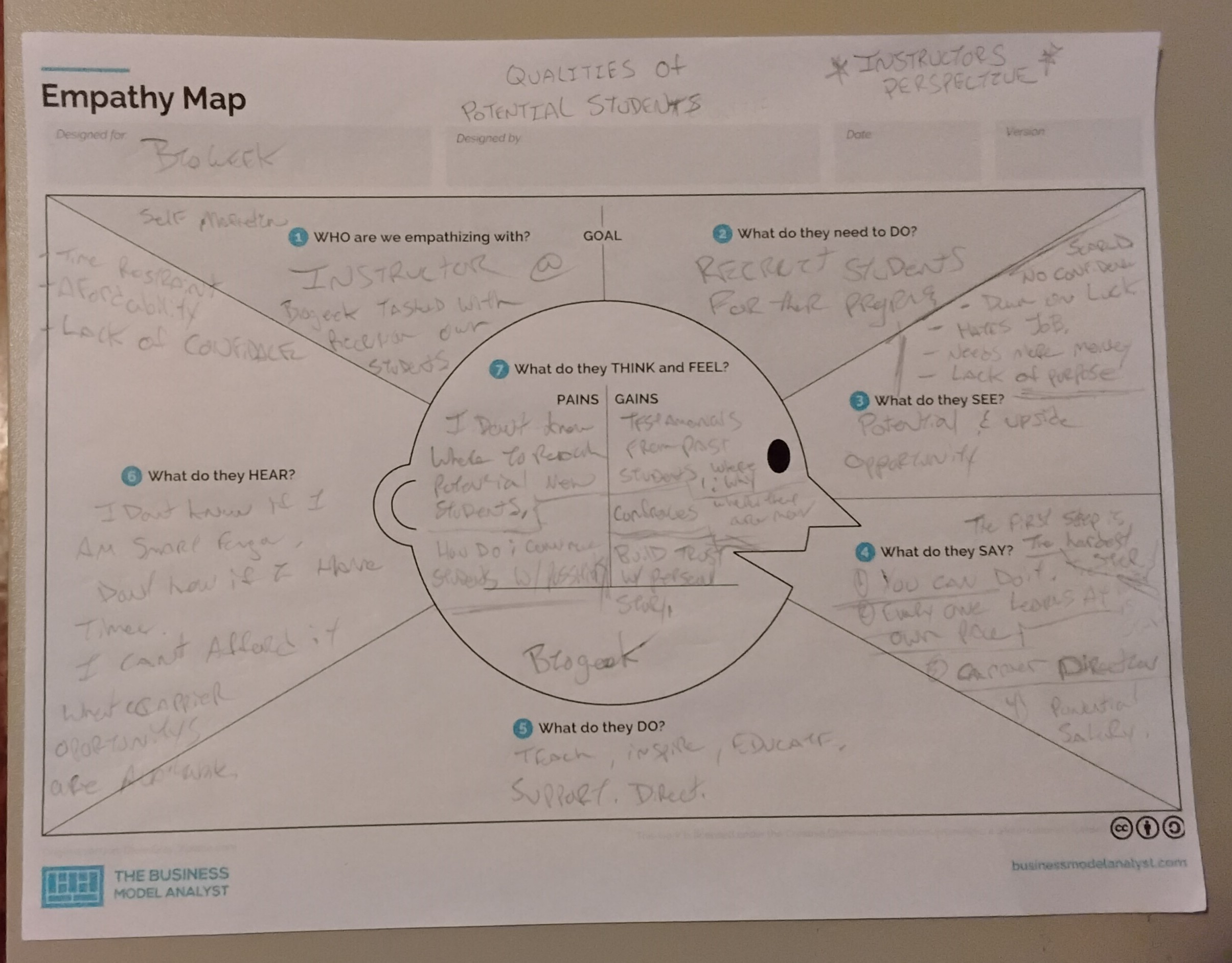
The empathy maps compare what the student feels from inside the learning experience with what a BioGeek instructor might notice from the teaching side. Together, they clarify how the platform should reduce hesitation while still respecting the learner's ambition.
The student wants to learn biology at their own pace, feel inspired, and know the content is organized and trustworthy. Their doubts center on time, commitment, affordability, and whether the course will feel clear enough to continue.
The instructor sees potential students who may lack confidence, time, money, or direction. BioGeek needs to help instructors build trust quickly with credentials, approachable lessons, clear pathways, and steady encouragement.
Wireframes
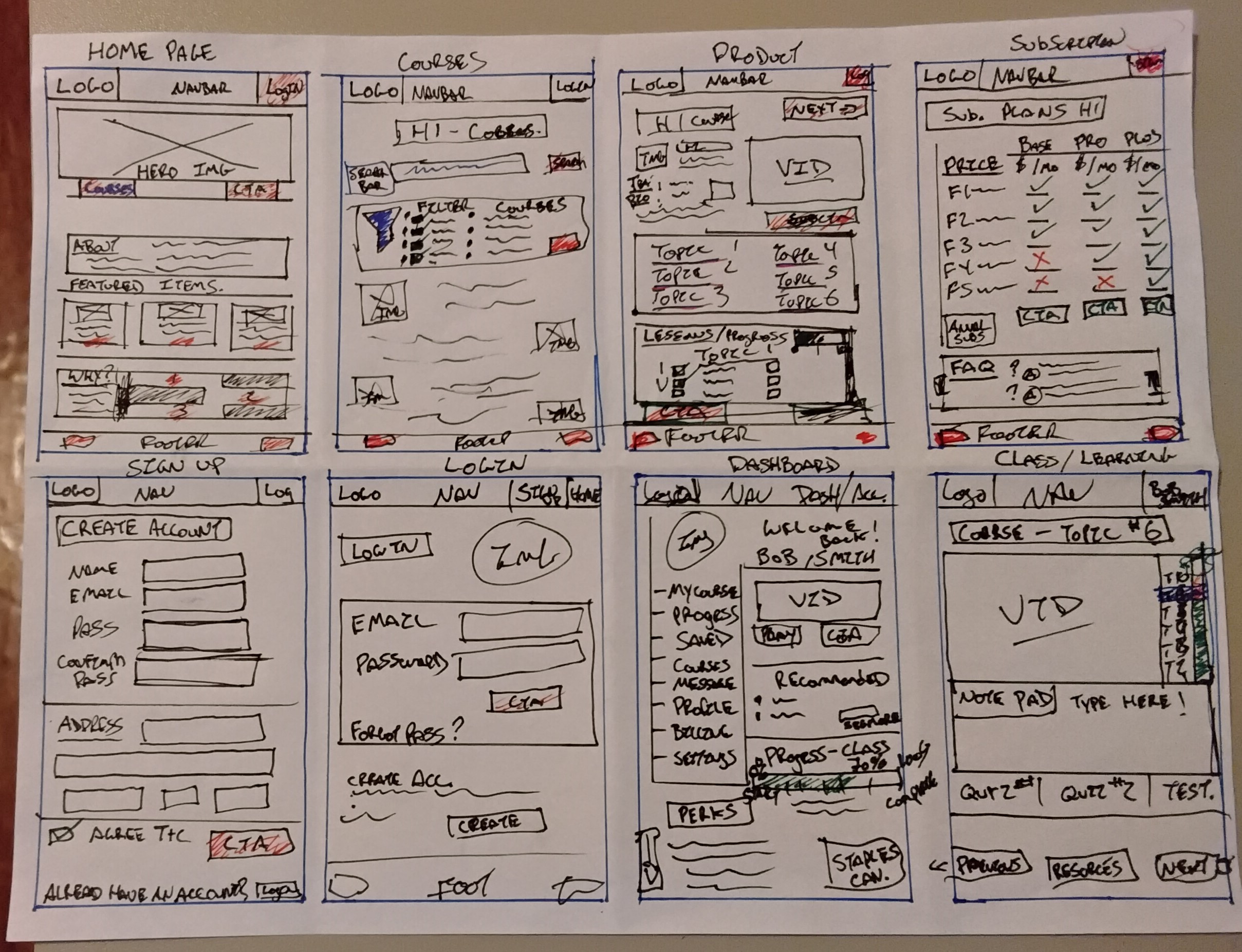
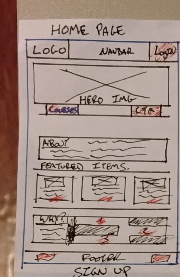
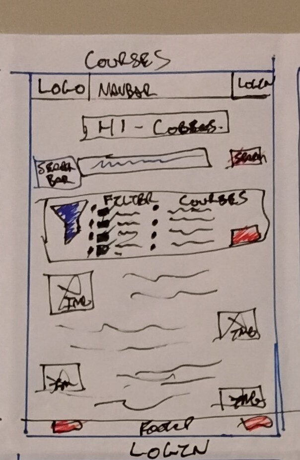
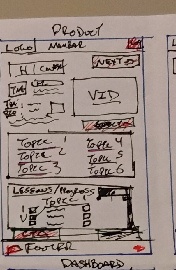
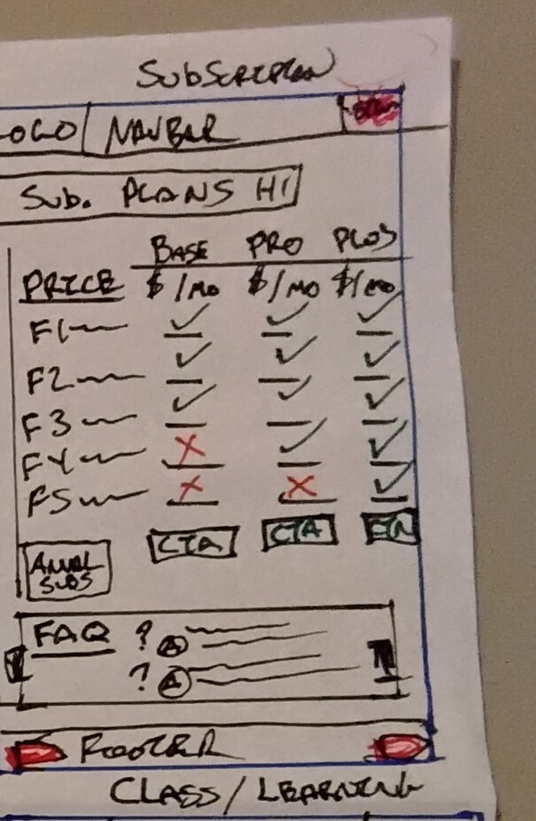
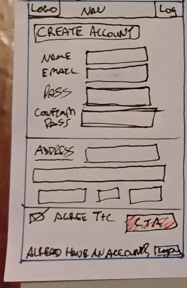
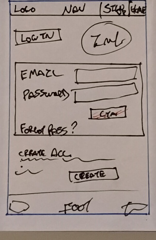
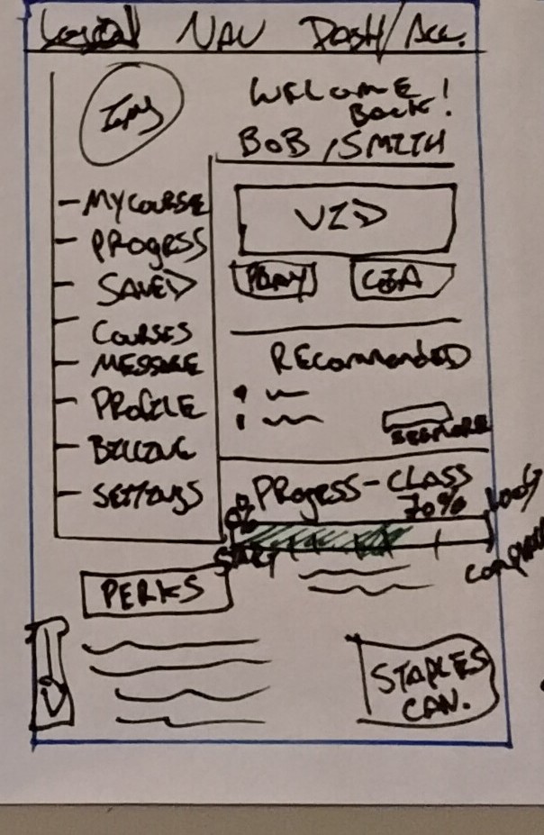
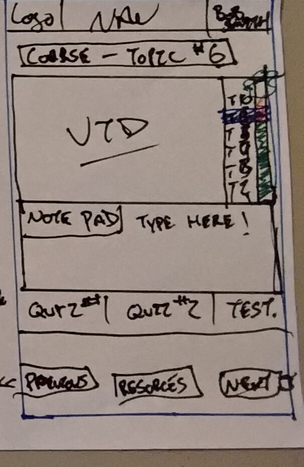
The Crazy Eights sketch tests the required BioGeek screens quickly: home, courses, product, subscription, sign-up, login, dashboard, and class view. This rough pass helped separate browsing, payment, account access, and learning into clear page responsibilities.
Access + Interaction
The service flow supports both browsing and account access. Users can preview sample lessons first, choose a plan, create an account, then land in a dashboard that makes progress and recommended content easy to scan.
High-Fidelity Direction
Using the journey maps, empathy maps, and wireframes as reference, these high-fidelity page concepts show how BioGeek can feel trustworthy, calm, and instructor-led while still carrying the excitement and wonder of biology.